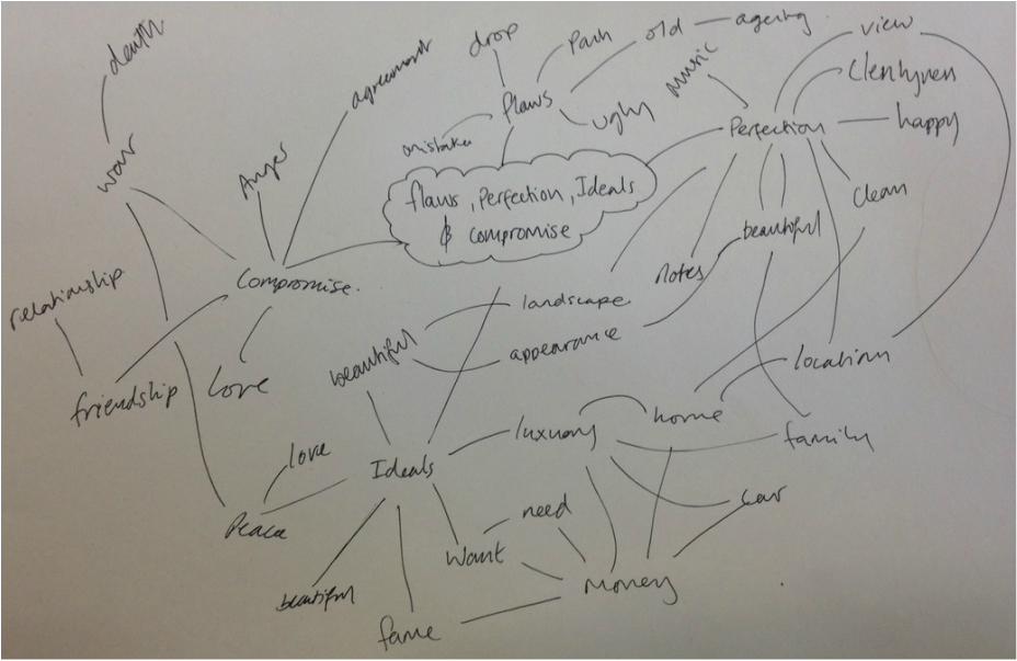
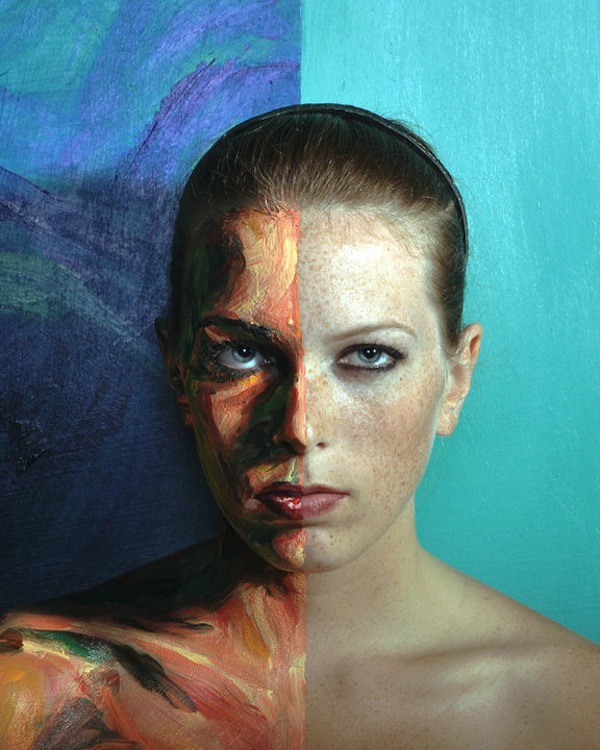
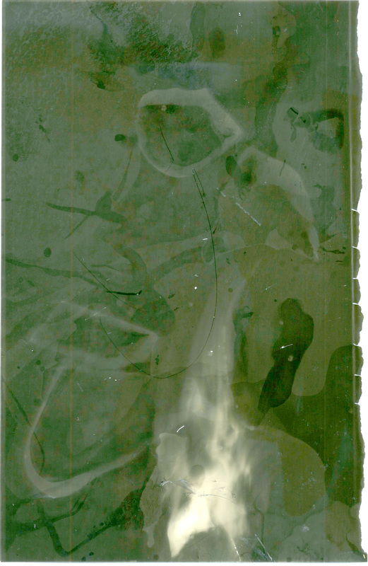
Flaws, Perfection, Ideals or Compromises
Making young people old
|
Original Image

|
Old Photoshopped Image


|
Here is the YouTube tutorial I used.
|
|

|
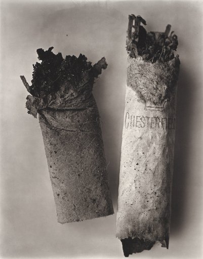
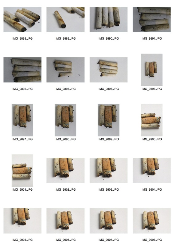
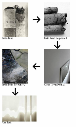
In this section I will be looking at everyday objects or things that you see everyday that may be regarded as ugly, although I will try and portray them as beautiful, a key artist I will be looking at is Irvin Penn. He takes everyday objects such as grimy cigarette butts and photographs them in an interesting and beautiful way.
Irvin Penn
Irving Penn (June 16, 1917 – October 7, 2009) was an American Photographer known for his fashion photography,portraits, and still lifes. Penn's career included work at Vogue Magazine, and independent advertising work for clients including Issey Mayake and Clinque. His work has been exhibited internationally, and continues to inform the art of photography.
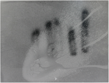
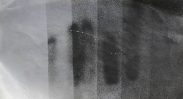
The work of Irving Penn I will be looking at is his study called cigarettes. Penn started with arranging everyday life objects. These became conceptual works of art. In his study 'cigarettes' Penn found his subjects in the streets, he then bought them in to his studio and created minimalist compositions. Here are some examples of his study.
The work of Irving Penn I will be looking at is his study called cigarettes. Penn started with arranging everyday life objects. These became conceptual works of art. In his study 'cigarettes' Penn found his subjects in the streets, he then bought them in to his studio and created minimalist compositions. Here are some examples of his study.

|
|
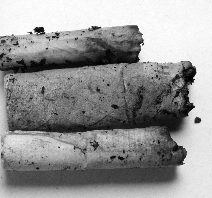
These images are really beautiful, The main focal points of the images is the text on the cigarettes, that is if there is test otherwise it is the burt end of the cigarette. Putting the images in black and white gives the images a really nice look. It also makes the images tonal and means you can focus on textures that arise from the burt cigarettes, for example in the image on the left the right cigarette has a really amazing texture at the top of it. This may not be visible if the pictures were in colour, a colour image would also draw your attention to the brown filter in the cigarette. This would ruin what Penn was trying to achieve. The negative space around the cigarettes allows you to focus only on them, this allows these to become the integral part of the composition and to stop you being distracted by the background. Below is my response to this study.
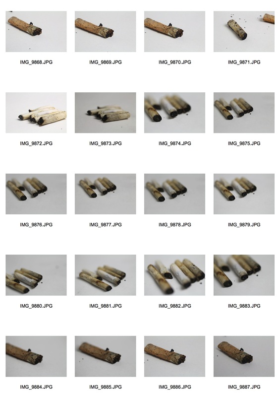
Here are my contact sheets.
Here are my contact sheets.
|
|
Here are my favourites.
I really like these photos, I feel I really captured the style of photo that Penn created. Although I feel I put a contemporary spin (not photographing the cigarettes from only above) on it which I also really like.
Artist and me
|
Irvin Penn

|
Me
|
I feel I really managed to capture the same essence of image that Irvin Penn was trying to capture. Both our photos are mono-tonal which I think is really nice as it means you can focus on the shapes, shadows and the details within the image rather than being distracted by colours. I really like photographing in black and white as it makes the image really strong. The only problem with my images is how the cigarette butts are a bit wet, I think my image would have turned out better if they wet dry. I like how i photographed the cigarette butts to the horizontal rather than vertical, this is what Penn does not do and I think it is nice to put my own spin on it. Overall I feel our images are very similar.
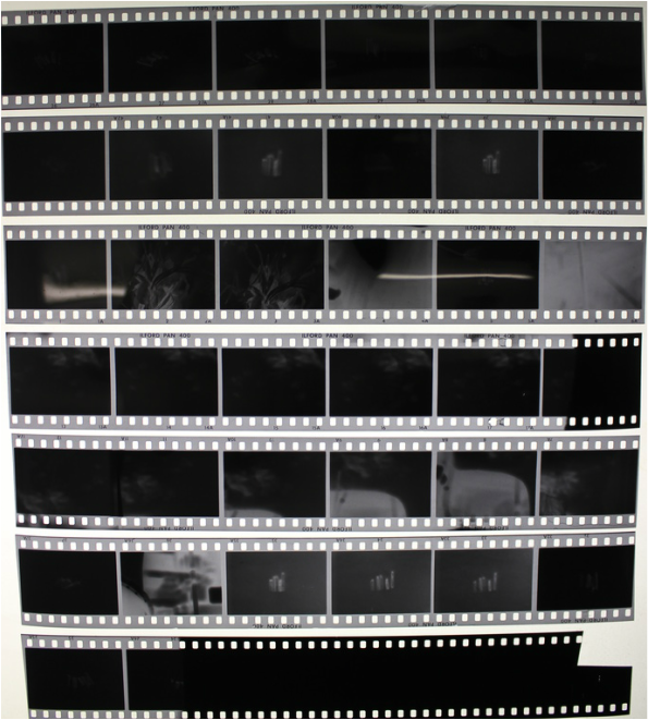
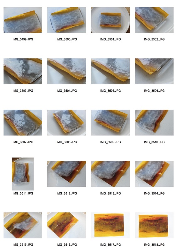
While I was photographing these photos in the style of Irving Penn I photographed these cigarette butts and some other stuff in film, Here is my contact sheet.
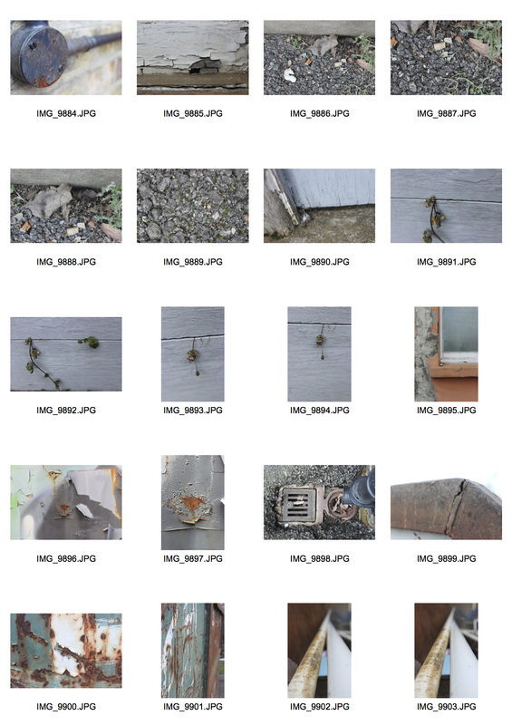
After doing these photos I went out and walked around my local area, photographing things (in the style of Irving Penn) that as seen as ugly in everyday life. Here are my contact sheets.
Here are my favourites.
I feel these worked really well, I managed to find things that are perceived as ugly, for example I found weeds, rust on a skip and a crumbling wall. These things are not thought of as beautiful, but I feel i managed to photograph them in such a way that they appear beautiful.
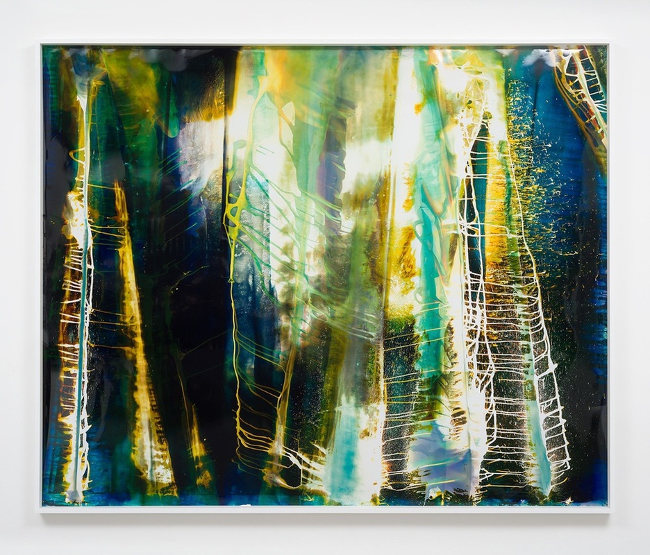
Mariah Robertson
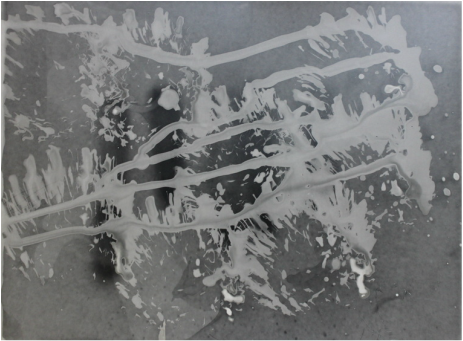
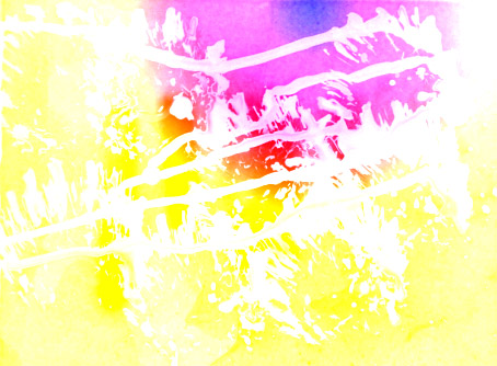
Mariah Robertson is an artist living and working in Brooklyn, New York. Her primary medium is photography, but her works are often exhibited as installations and considered sculptural. She has exhibited work internationally including at Saatchi Gallery in London and MoMA PS1 in Long Island City. Her photographs are created using many different techniques, for example she uses a dark room, she combines and enlarges negatives, she places things onto her photographic paper, she drips, paints and splats chemical onto the paper, exposes it to coloured gels, she uses many different types of light to expose her images for example a torch.
Some examples of her work are below.
Some examples of her work are below.

|
|
I really like these images, They are really abstract and I like that, I also really like the idea that under the image there is her original image which if you like is the base to this creation. The idea of putting things on to photographic paper, developing it and just seeing what happens is really fascinating too me. I think this is because there will be no two pieces exactly the same. Photography is generally quite standardised, where a print is the same as the print before but with Robertson every print will be different and unique. I also really like how she uses a range of colours, The main focal point of the images is the white yellow flash, this works well as from this you then see loads of different colours and a very interesting image.
Below is my attempt at creating work int the style of Mariah Robertson.
To create these images I used Developer and Fix in different ways to get different effects. I also used an aperture of f8 and I exposed the photographic paper for 9 seconds.
Below is my attempt at creating work int the style of Mariah Robertson.
To create these images I used Developer and Fix in different ways to get different effects. I also used an aperture of f8 and I exposed the photographic paper for 9 seconds.
I sprayed fixer onto the paper before I exposed the image onto it.
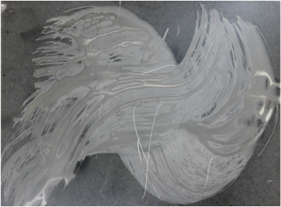
I sprayed developer onto a brush then painted the developer onto the paper
|
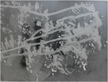
I sprayed developer onto a brush, then hit the photographic paper with the brush.
I sprayed developer onto the image then exposed it, This is my favourite out of the four.
|
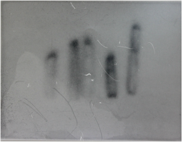
Here is my test strip to show how I chose the appropriate amount of time to develop the images.
Each interval is 3 seconds long, I chose a 9 second exposure time.
Artist and me
|
Mariah Robertson

|
Me
|
I feel my attempt at creating work in the style of Mariah Robertson was not a bad one. The main flaw was the fact that Robertson uses colour on her image and I was not able to do this, however I was very able to manipulate the image and change it, which I feel I did well and successfully. On Robertson's photos it i shard to see what the original photo was and you do not really get any sense of what the image is of, however in my photos you can see the image behind and it is not all distorted. Some of the image is distorted and hidden which I think is really nice. If i was to try this again I would try using colour film and gels like Robertson.
After looking at the work of Miriah Robertson I decided to play around with and add some colours to my dark room experimentation, this is so they could be hore in the style of Robertson, below are a few of my attempts at changing the colour of the experiments.
|
|
I really like these photos, my favourite is the one on the right as I like seeing the white lines on the photo, I feel with the photos like this they are even more in the style or Mariah Robertson.
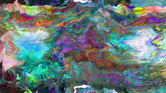
Glitch Photography
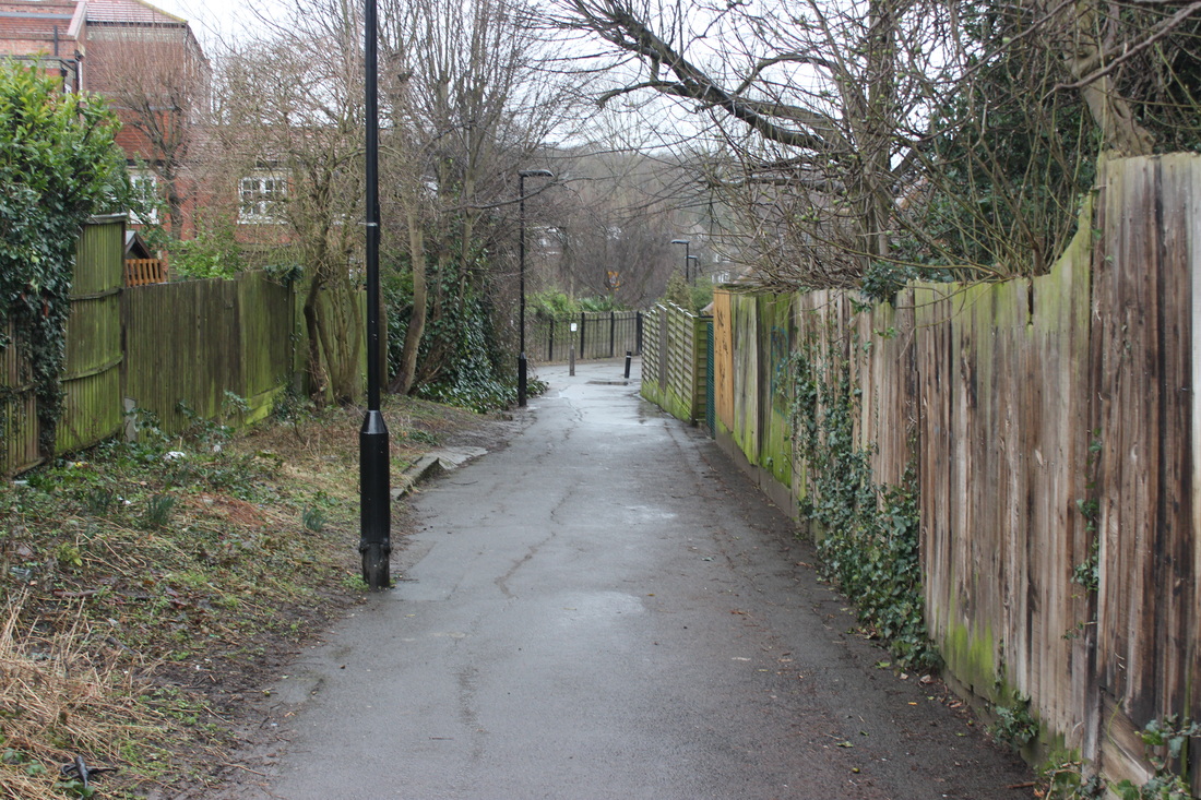
Glitch art takes temporary pixelations, interruptions and glitches and turns them into visually arresting pieces, questioning the forms and traditions of art using digital techniques. The idea is that visual artefacts and distortion from data corruption can look even better than the original. Here are the contact sheets of the images I will be glitching.
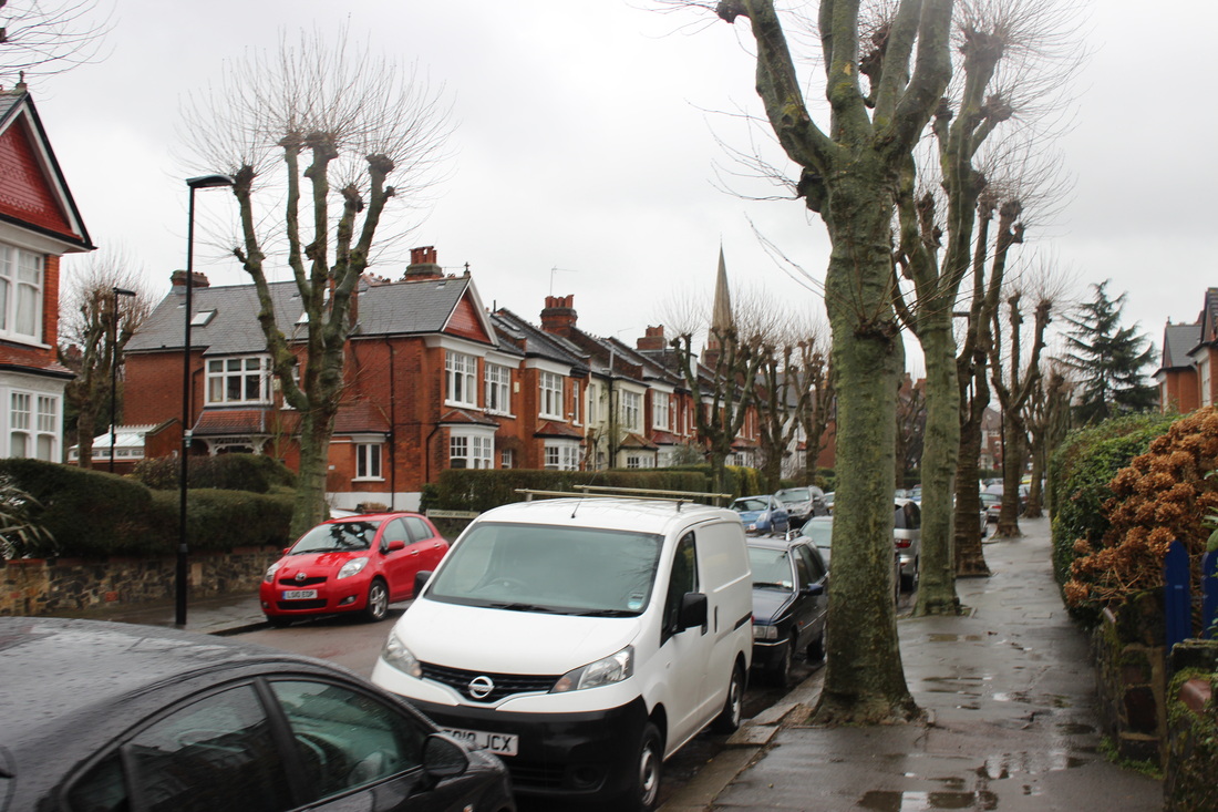
I decided to photograph landscapes because of the fact that there is generally always a standard form, what I mean by this is that they generally have a vanishing point and everything is the same size and height, and then by glitching these images you are removing all this form which I think is really interesting.
I decided to photograph landscapes because of the fact that there is generally always a standard form, what I mean by this is that they generally have a vanishing point and everything is the same size and height, and then by glitching these images you are removing all this form which I think is really interesting.
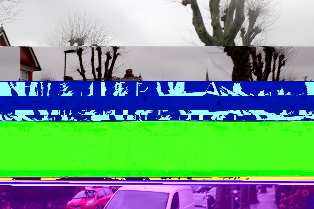
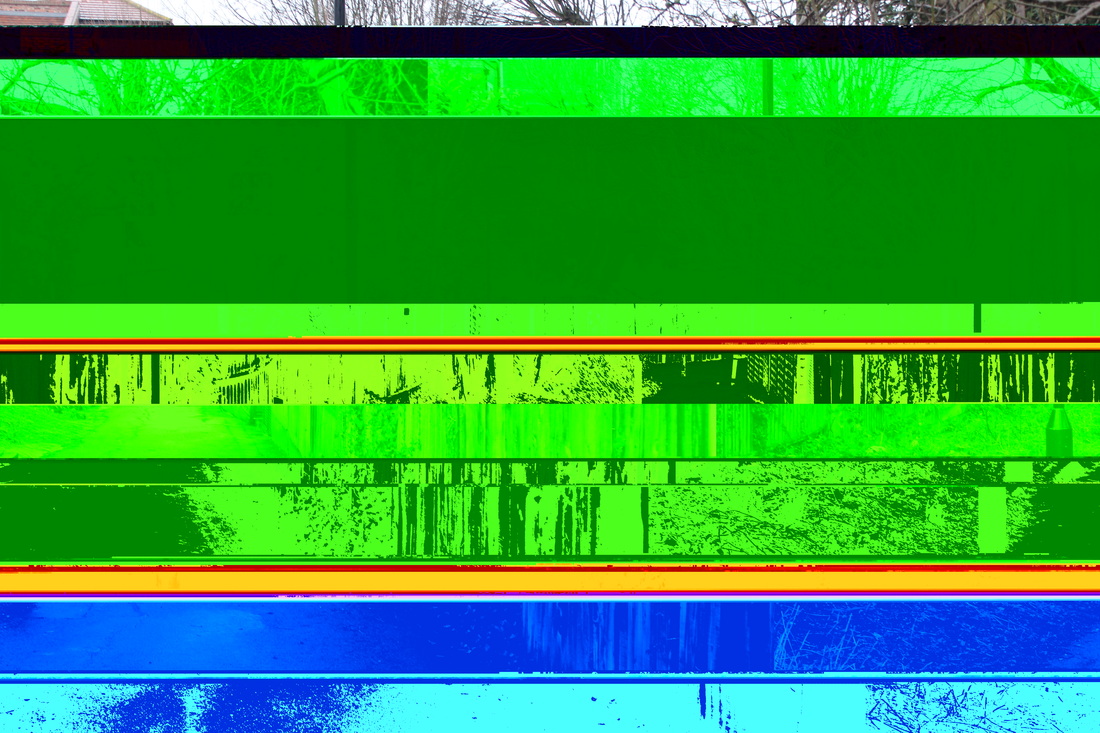
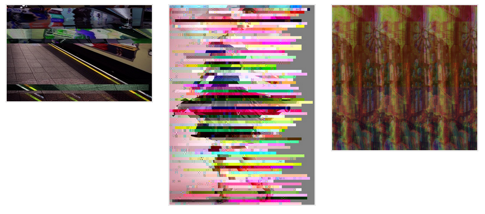
Glitching with Text edit
The image I will be using is below.
|
|
This is the video I have used as a tutorial.
|
|
When you drag a photo into TextEdit this is what appears, this is the coding for the image. This is what you change if you want to corrupt the image and create what I created above.
|
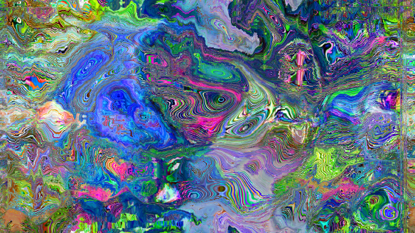
Glitching with audacity
|
|
Here is the youtube tutorial I used to create this.

When you put a photo in Audacity this is what you see, The image is the blue on the screen. Audacity makes the image into an audio file, to corrupt it you add effects to the image this will then corrupt and change the image as you can see I have done above.
Mathieu St-Pierre
Mathieu St-Pierre is a Canadian artist who focuses on visual artefacts created by various computer programs and from the more traditional analog video signals. The consequence of those imperfections and corrupted files are his landscapes and narrative images (stills). Also, having a film background helps him to compose with emerging medias and explore new possibilities of the digital canvas.
Here are some examples of his work.
Here are some examples of his work.
|
|
I really like this pictures and how they turned out, The part of glitching that I really like is how you do not know what is going to happen, After a while to can get some idea what happens when you alter a certain part of code. For example you find out that if you alter the first 1/4 of the code the image will not open, from this you can work out other trends although you are never sure what exactly will happen. There is not really a main focal point in any of these images as the whole image is very interesting. Having said this I think that the purple swirls in both of the images are the main focal points.
Artist and me
|
Me

|
Mathieu St-Pierre

|
Both these images are similar and yet so different, they are both glitch photography. And both the original images have been changed in some way. Although St-Pierre's image is extremely beautiful, exciting and vibrant it is also so distorted that you do not know what the image was originally, This can be nice although personally I prefer it when you can see the underlying image or at least a bit of it like my photograph, If you cannot see any of the underlying image, it is just an array of random colours.
Here are some more examples of glitch photography done by a photographer called Daniel Sutton-Klein, He used audacity like I have done above. The three photographs below look really good, I really like how he appears to have controlled the image so it glitches in a way near enough to how he wants it too. They are also really interesting images, The other thing I really like about them is how you can still see the original image behind them.
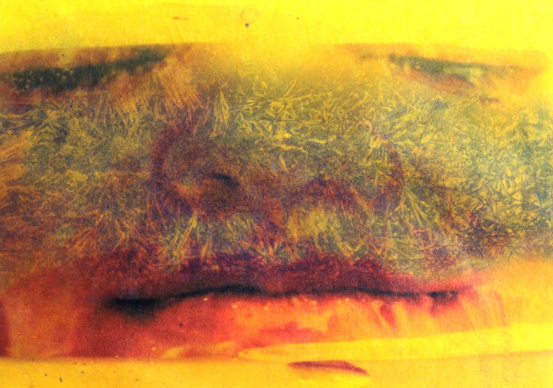
I decided to re visit the work of Irvin Penn and take photos of things that are perceived as ugly but in a nice way. my contact sheets are below
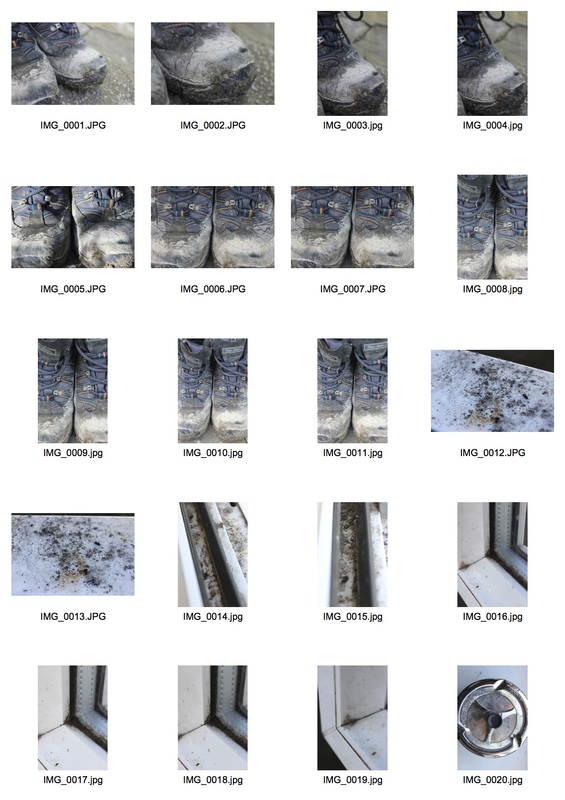
|
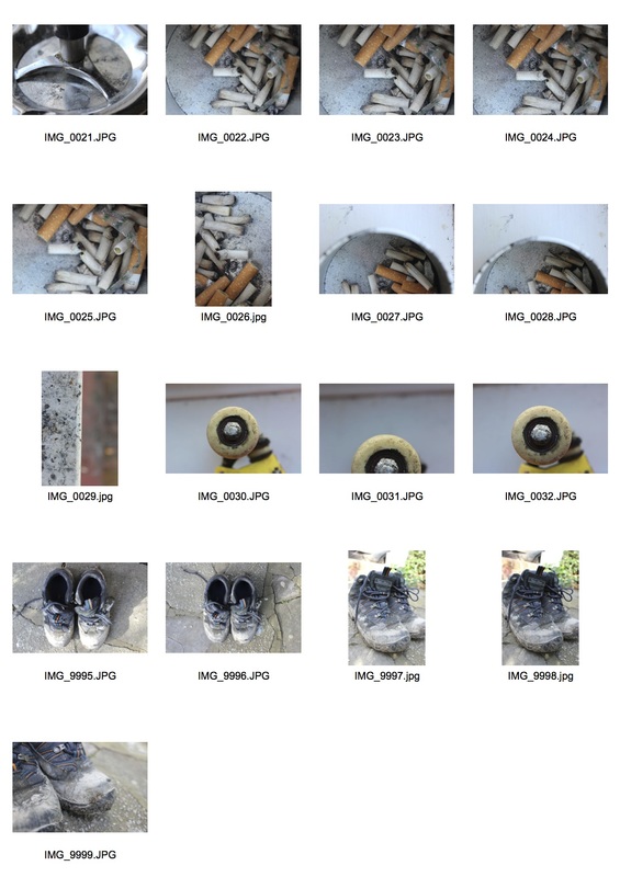
|
I really like these photos although after reviewing them I have decided that they look a lot better in black and white, below are the colour photos.
I then put the photos into black and white, these are below.
I really like how these turned out, I feel that black and white helps display and bring out the grittyness and dirtyness of the photograph compared to coulour where I feel you lose some of the power of the image. I also feel I managed to capture the style or Irvin Penn's photos.
After doing the strand above I decided to do a contrasting strand where I take photos of clean things rather than dirty things, below is my contact sheets.
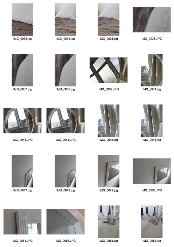
Below are my favourites.
I really like these images, I really like how they are so simplistic and easy to look at, I tried putting one of them in black and white to see how that looked , this is below.

As much as I like this photo in black and whit I feel it is unnecessary and I feel it ruins the photo, I really liked the pastel purple in the original photo.
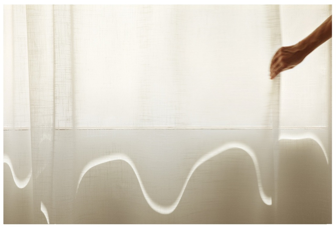
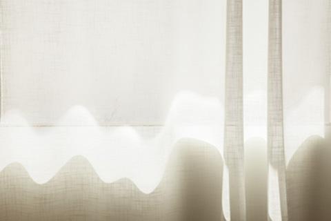
uta Barth
Utah Barth is a contemporary photographer who lives and works in Los Angeles, California. She does most of her work at home as she mainly photographs light. Here are some examples of her work:
|
|
I really like Barth's work, I really like how simplistic and easy it is to look at, I really like how she plays with light and uses everyday items or just the focus on a camera to blur the photograph or change how the light behaves, for example in the photographs above she uses curtains to give the sun light a wavy look, I think this is a really nice effect.
Artist and me
|
Me

|
Uta Barth

|
Although these photos are completely different, I feel they are also very similar in many ways, For example both the photos are very simplistic and because of this I think they are very calming and easy to look at. I really like how u can see lots of textures in the images, for example in my image you can see the texture of the pillow against the different texture if the duvet and in Barth's photo you can see the texture of the curtain and I really like how this texture appears to disappear when the light in on the curtain, however I like the purple in my image, I feel it adds something that is missing from Barth's photographs.
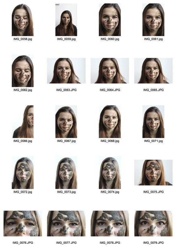
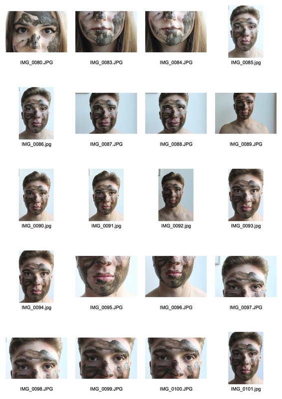
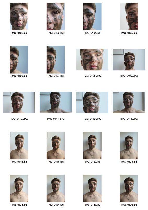
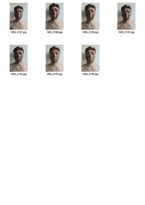
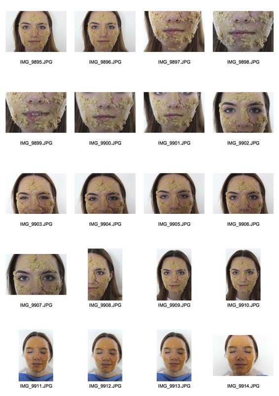
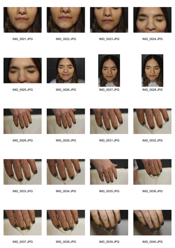
After looking at clean things I decided to revert back to the idea of grime, dirt and unease. I put mud onto peoples faces and photographed them, I found this very interesting as faces are normally very clean (eyes, mouth, nose and ears) it is very alien to have dirt on your face and make you very uneasy, it is also hard to look at it's a juxtaposition between the clean face and the mud/ dirt. Below are my contact sheets.
|
|
|
|
I really like these images, here are my favourites.
I decided to put these photos in black and white, I feel its better than colour as it is nicer to see the tones rather than the colour, also when there is no colour it means you can focus on the texture of the image more, as you can see there are some interesting textures in the mud on their faces.
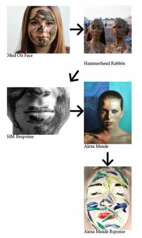
Hammerhead Rabbits
Hammerhean Rabbits is a group of photographers and artists living in new york, their work is below.

|

|
In these photos different things are being put onto peoples faces, This is interesting as you get really nice textures and interesting shapes from them, for example the mud on the peoples faces make their heads really flat and make them look plain, where as the hundreds and thousands make the image really interesting, how ever I feel that the photos would look a lot better if they were in black and white.
Artist and me
|
Me

|
Hammerhead Rabbbits

|
These photos are very similar as they both are of mud on someones face, however I much prefer my photograph tho Rabbits, This Is because the mud has a much more interesting texture on mine, I feel that the mud has just kind of been slapped on in rabbits photograph, I could have used more mud in my photo probably. I also really like the fact my photo is in black and white, as this brings out the texture more and help you notice the mud, compared to Rabbits where the mud is hard to depict as it just looks like the skin of the people in the pictures, this makes the image very un-striking.
I then decided to zoom in on certain parts of these images that I thought were uncomfortable or alien to us I put them in black and white so u can see the texture of the images more clearly. My favourites of these are below.
I really like these photos, there is something about seeing the mud on their lips and near their eyes which make you feel really uneasy, I feel these photos are also really strong and the black and white allows you to see the texture of the mud and the mud mixing in with the hair on their face, this is very interesting.
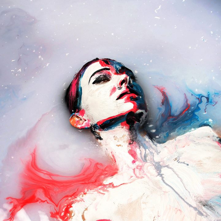
Alexa Meade
Alexa Meade was born 1986, she is as American artist and is best known for her portraits painted on the human body, she takes a classical concept and technique called trompe l'oeil (the art of making two dimensional things look three dimensional) and does the opposite, for example collapse depth and make her living odel into 2D pictures. The result of her work is walking and talking optical illusions. below are some examples of her work.
|

|
These pieces are amazing, Meade takes a human model and then paints them so they look like they are a painting, in the picture on the right, Meade actually painted the whole background and the man so there is nothing obvious about the image to say that its not a painting. I really like how she does not paint the models perfectly but in fact paints them crudely although I feel this really adds something to the images. I also really like how she has turned 3D things in a 2D picture, this is the opposite of what people tend to do, however I think it is a really good idea that has been executed really well. She seems to use natural lighting rather than using a flash, this is nice as it causes the white wall to not be too strong and allows the brush marks to be visible and strong. The negative space she use is the wall behind the model, she uses colour on this negative space so it is a bit more interesting, but not enough so your eye is drawn away for them main integral part of the image.
I decided to look at this idea of making something that is 3D, 2D. Below are my contacts sheets.
I decided to look at this idea of making something that is 3D, 2D. Below are my contacts sheets.
|
|
Here are my favourites.
I really like these photos I feel they are really strong and they work really well, I feel I have managed to capture and execute the idea of making something 3D look 2D like what Alexa Meade does. To create these images I painted his face in white paint and then painted in his lips eyebrows and eye lashes. To make it look 2D i put white paint in the water surrounding him. After this I painted some other coloured paint across his face. This was to make the image more interesting. My favourite photos here are the close up ones as I like seeing the texture or the paint on the face and also I really like the idea of having something un-natural on your face, In this case this is the paint.
Artist and me
|
Me

|
Alexa Meade
|
These photos are very similar, They both play with the idea of making something that is 3D e.g. a person into a 2D painting and photograph. Both the models are painted white and then have other colours of paint on their faces, to make the photograph more interesting. The water was also made white , this is to give an enhanced effect of the image turning 2D, In my image I did not paint the hair, this causes the 2D effect to not work as well, however in Meade's she paints the hair of her model to complete the effect.
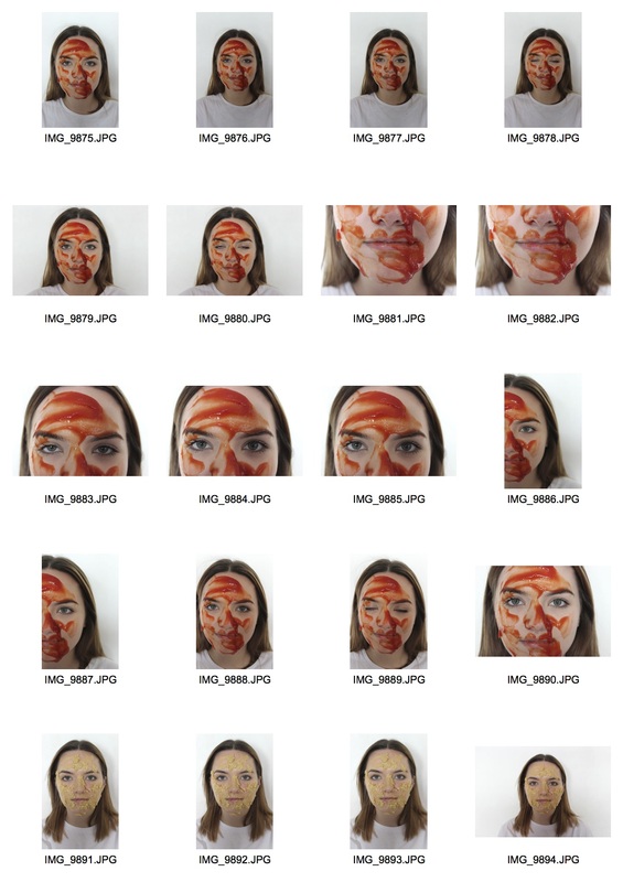
After doing this I decided to re look at the strand above (with the mud) except use different things instead of mud, below are my contact sheets.
|
|
Here are my favourites.
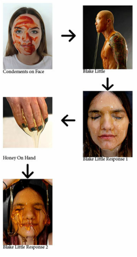
These photos are really interesting, I really like the texture the different sauces and spreads make when they are on her faces, my favourite photos therefore are the close up ones of the lower half of her face. I also like the idea of having things on your face that should not be there, Also like edgy and uneasy photographs, This is when you see the ketchup on the edge of her mouth, it makes you feel uneasy. I like playing on this idea. Below are some examples of this idea.
|
|
These photos are really interesting, I really like how they are hard to look out and make you feel uneasy, Like I said above, the ketchup going down the side of her mouth, the golden syrup going slightly into her mouth and the peanut butter spread over her lips.
|
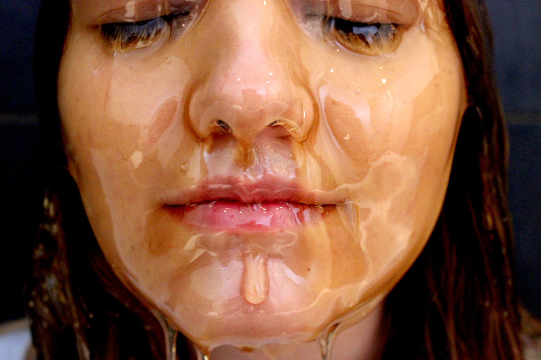
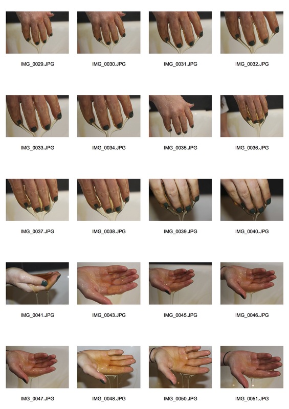
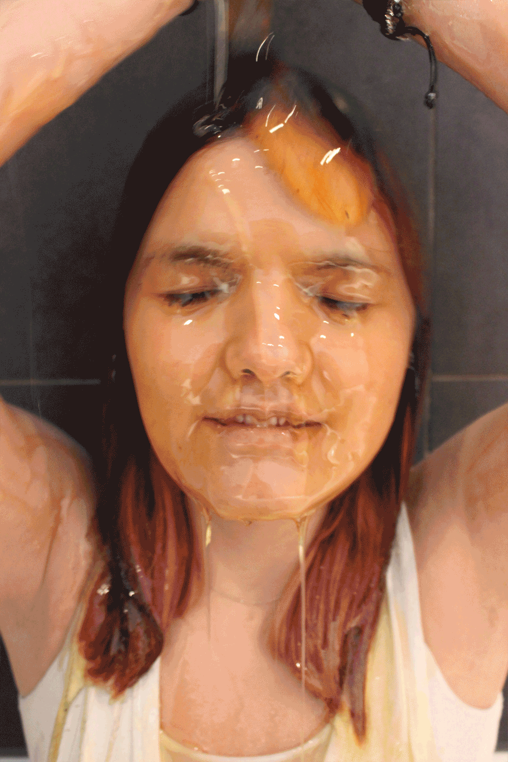
These are good, but next time I will cover her in honey, as it will give a much better effect. This will also then be able to directly link with the artist below.
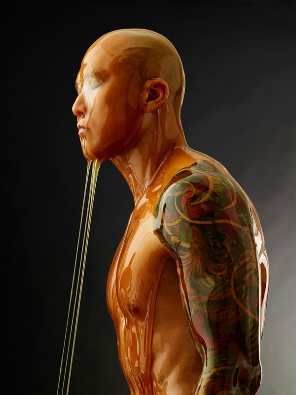
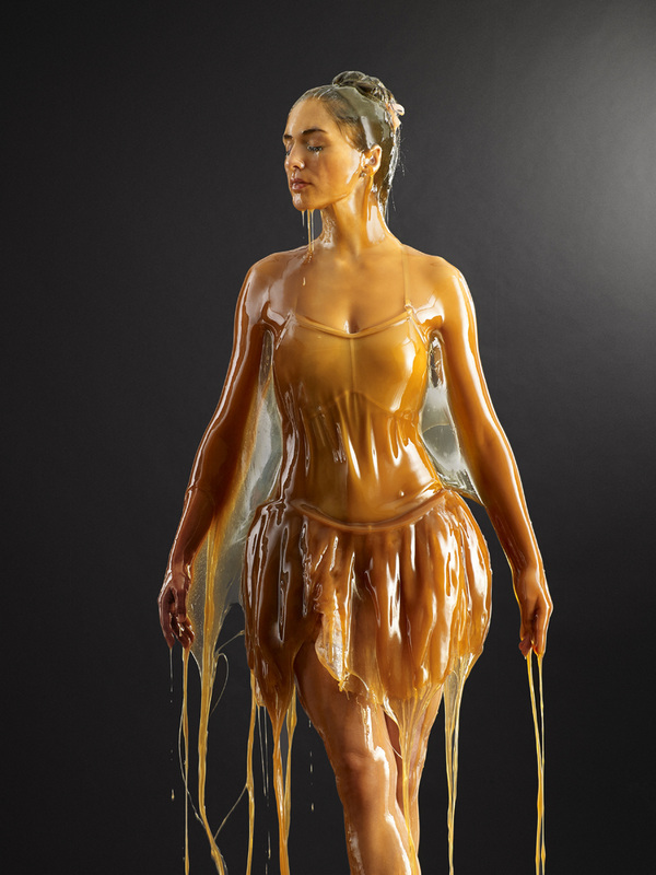
Blake Little
Blake Little is an award winning, Los Angeles-based photographer best known for his ability to intimately capture the energy and personality of his subjects. His skills as a portrait photographer have garnered him a reputation as a favorite amongst celebrities, international publications, and corporate clients. Here are some examples of his work.
|
|
Blake little creates these images by pouring buckets of honey onto his models. These photos are really interesting, I really like how you can never be sure how the pictures are going to turn out and how the honey is going to behave and fall off the model, I also really like how the honey flattens everything down, for example people hair and makes them a lot less defined, The main focal point of these images is the where the honey is falling off the model onto the floor and the faces and hair of the models. The negative space around the model is really nice as I makes it really easy to see the honey on the model, the person covered in honey is the integral part of the composition. The models are lit from the left, This is really good as it causes the honey to have different colours and tones, this causes the photographs to be more interesting and look more three dimensional then they would be He calls this work preservation as he views his models as being preserved in amber.
|
Here is a video showing Little's processes.
|
|
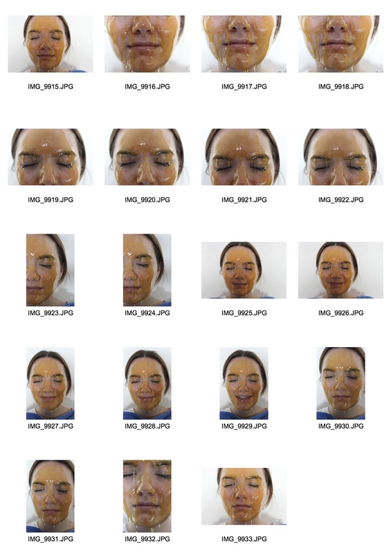
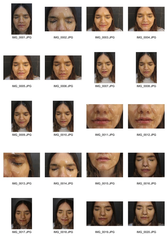
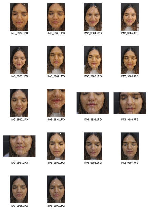
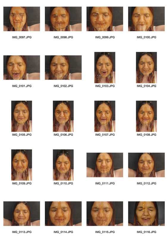
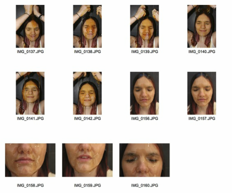
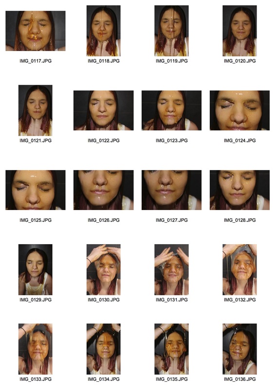
I decided to create some work in this style, except just use someones face instead of their whole body. Below are my contact sheets.
|
|
Here are my favourites.
I really like these images, I like the texture the honey creates, the link endless smoothness. It is as though the honey gets rid of any and all imperfections and makes the face into one simplistic form. However the honey can also lump up like it does on the chin of some of the images, this then makes the photo not perfect and smooth, but it gives the photo a nice effect.
|
To create these photos I used 10 pots of this honey, This is plenty of honey apart from the face that it is really and runny which there fore means that it drips and runs off really quickly and this causes some bits of face under the face and nose where there is no honey, this is not that much of a problem as I could just scoop up the honey and put it back on her face, ideally I would have double the amount of honey and maybe use golden syrup instead so it is thicker and less runny.
|
|
|
Here is a time-lapse video I took while I was creating the pieces above. Although it is quite fast it shows my process and how I created what I did.
|
How the honey and the eye-brows and eye-lashes react together is really interesting and intrigues as well as how the honey runs over the nose, below will be some close ups of this.
The reason I like these image sis because of how they make you feel really uneasy and uncomfortable, I spoke about this in the strand above. I also find it really interesting how the honey seems to smooth out all the rough edges on the faces and the body's of people yet it still makes its own contours and rough edges as we can see in the photos above.
Artist and me
|
Me
|
Blake Little

|
Both these photos have black negative space around them, This causes the person in the photo to then become the integral part of the composition It also allows the colour of the honey to be more vibrant and obvious. Little's photographs are of more than just someones face, This is nice however I feel that just taking a portrait of the face is really interesting as you can see how the hair etc. reacts and moves with the honey. I really like how the honey causes all the flaws and contours on someones body to be covered up and yet the honey creates its own contours and folds as we can see on the eyebrows and the nose and mouth of the woman in my image and on the stomach of the man in Little's image.
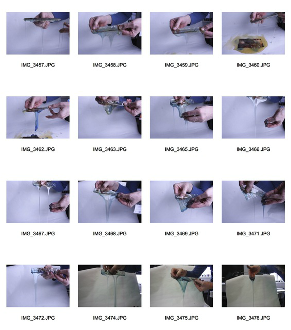
In Blake Little's video where you see his process, he talks about how he once photographed a men and made him eat honey to represent a bear eating honey, 'and when I looked at the images there was something about the honey dripping off of his hands that was intriguing an it looked like he was preserved in amber', because of this I decided to look at this. below are my contact sheets.
Here are my favourites.
I really like how you can see the honey dripping off the hand, I think it makes a really interesting shape and I also like the fact it is completely random and could have fallen in any shape. I also see what Little was talking about when he was like it was preserved in amber.
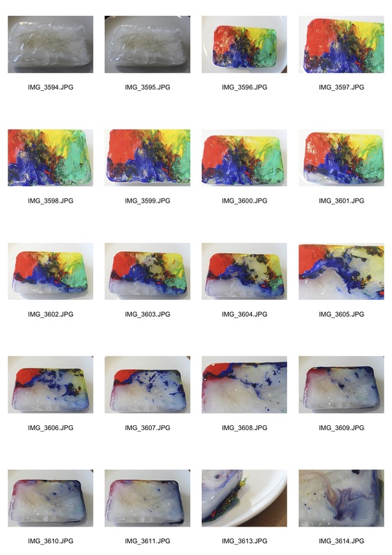
After doing these photos I decided to re-do it again but this time use five more pots of honey, I feel this helped a lot and made the photos even better than before. My contact sheets are below.
|
|
These photos are really good, here are my favourites.
I think these images worked out really well, the first image is blurred however I feel this makes the image better as it shows movement, The second and third images are my favourites. I find it interesting how the honey behaves when it falls from her hands.
Here is a gif and another time-lapse of this process.
Here is a gif and another time-lapse of this process.
|
|
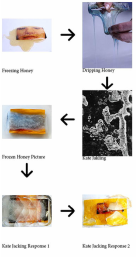
I then took and image from my previous development and froze it in honey. I then put the frozen honey on a piece of paper and photographed it as it melted, below are my contact sheets.
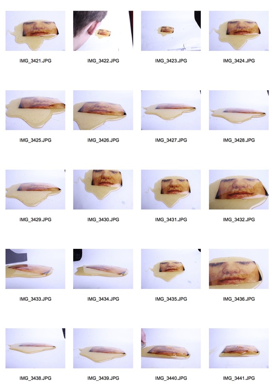
|
|
I think these photos are really interesting, I really like how if you look at this from certain angles it looks 3D, but when you look at it from other anglesit look like just a pile of honey, some examples are below.
The first two photos are of the honey melting, then I folded the honey over the photos so it looks incased in honey. I found this very interesting. Below are two videos of this.
|
|
|
These videos are very Interesting, I really like how the honey behaves differently each time you pick it up. This really interests me. The other thing I really like is how the photo does not move, even when the honey is scooped up a lot in the video on the left, image remains in the same place, This reminds me of looking at rocks in the sea and no matter how much the sea moves everything in it stays exactly where it is.
After this I decided to add food colouring to the honey to see how this would turn out, I used a ruler to pick up the honey an then pour it on the table, below are my contact sheets.
The last three photos were not as good as the others, This is because I did not use the studio flash, therefore meaning that there is some blurring and it does not appear to be frozen although the colours were more vibrant and obvious in the photos with no flash.
Below are my favourites.
Below are my favourites.
These photos are really amazing, I really like how the food colouring has not completely mixed into the honey, this makes it more interesting. Like the videos above, you are never exactly sure where the honey is going to fall or even how it is going to fall. I really like that fact that you can manipulate how the honey falls as it is quite thick, you cant do this with water for example (you can see this in the third picture where the man is holding the honey). There is also something about the blurred photograph which is really intriguing, I really like how the honey appears to be frozen when it is on top of the ruler, but when it falls off it blurs, this means you are able to see the motion.
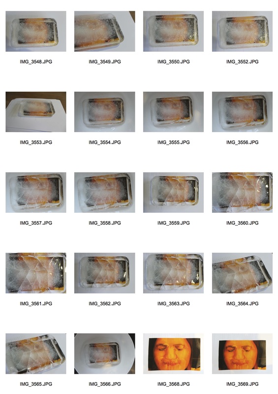
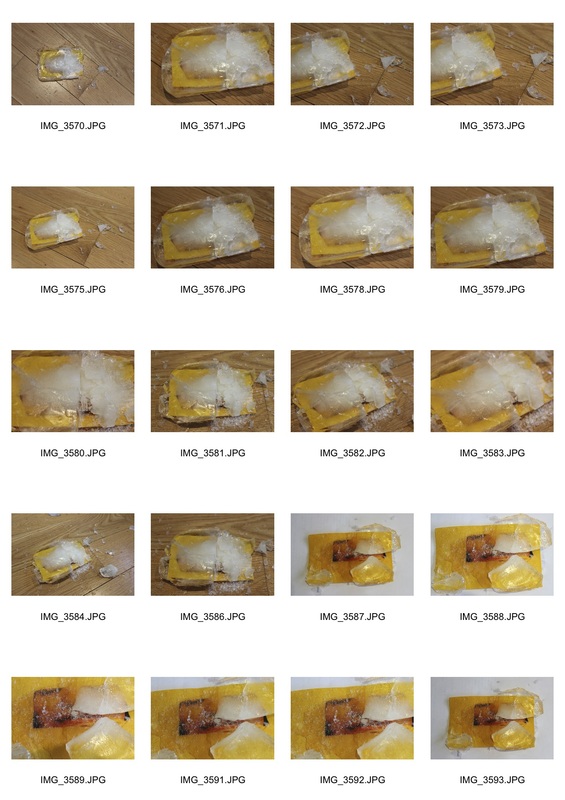
After pouring honey over people I decided to look further into the idea of freezing things. I took my previous photos and printed them, I then froze them in ice, below is a picture of this.
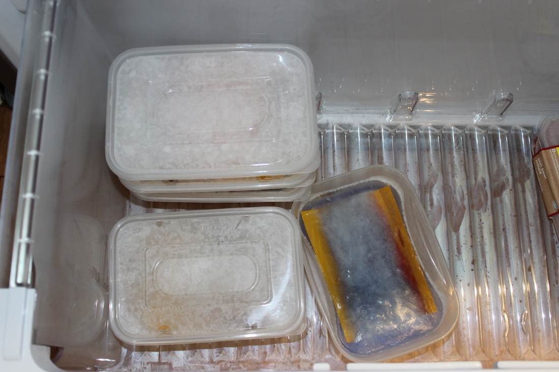
|
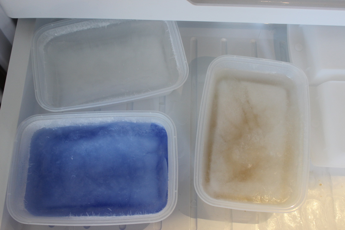
|
For my first strand I took the ice with the photo inside and proceeded to melt it with a hair dryer. This is so I could photograph it in stages. I also filmed it and made a time lapse this is below.
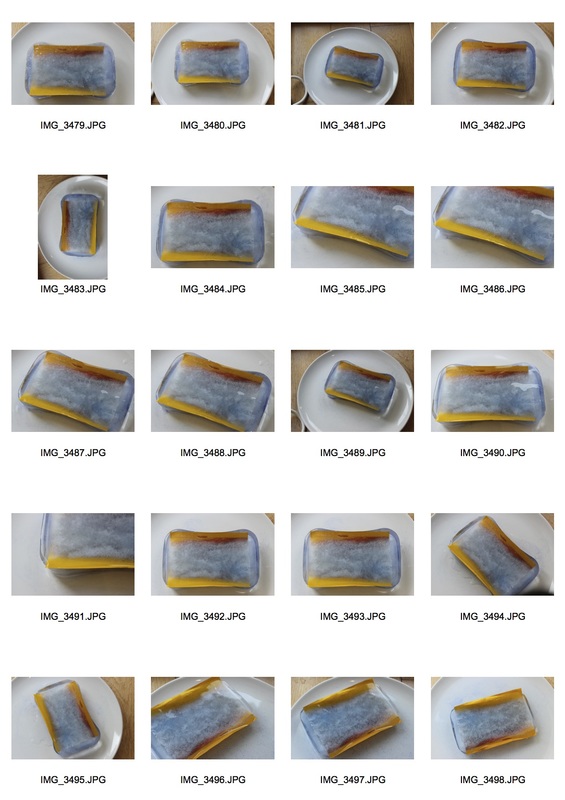
Here are my contact sheets of these images.
|
|
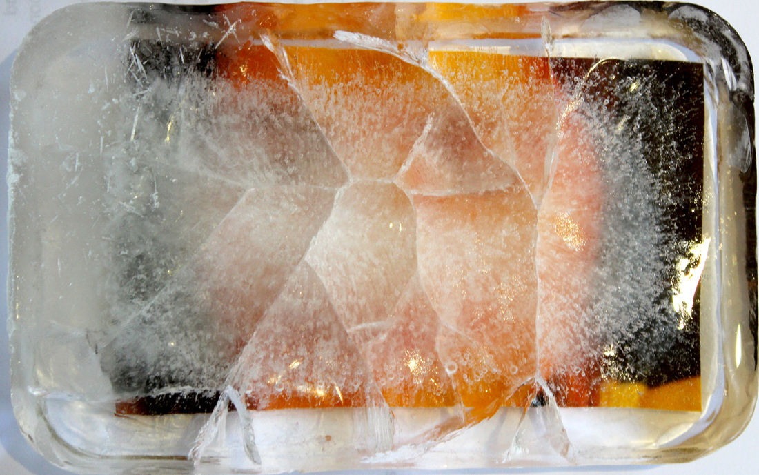
To create these photographs, I froze a previous photo I had taken of honey into ice, I used blue acrylic paint to give the ice the blue colour. To melt the ice I used a hair dryer, this can be seen in the time lapse above. some of these photos are really interesting, my favourites are below.
I really like these images, I think the blue paint in the ice gave a really interesting effect, I really like how it is slightly see through, this makes it really interesting how you can see the corners and the sides of the picture frozen in the ice but then you are not completely sure what the rest of the image looks like.
This photograph really interests me, This is what the printed photograph looked like after the ice has melted, the ice had imprinted this pattern onto the photograph.
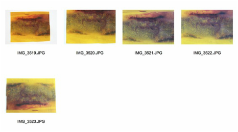
kate jackling
Born in the Shires in 1979, her photographic background was fuelled by a passion for analogue and Polaroid photography. After graduating from Nottingham Trent University and assisting full time for many years, it was time to experiment herself. With a technical knowledge gained from years of large format photography and influenced by the Bauhaus movement, she has firmly created her own style in the world of still life. Beautifully working with natural materials, Jackling creates an elegance and simplicity in her images by exploring shape, texture and sculpture.
Her 'chemistry' project is really interesting to me. Here are some examples of her
Her 'chemistry' project is really interesting to me. Here are some examples of her
|
|
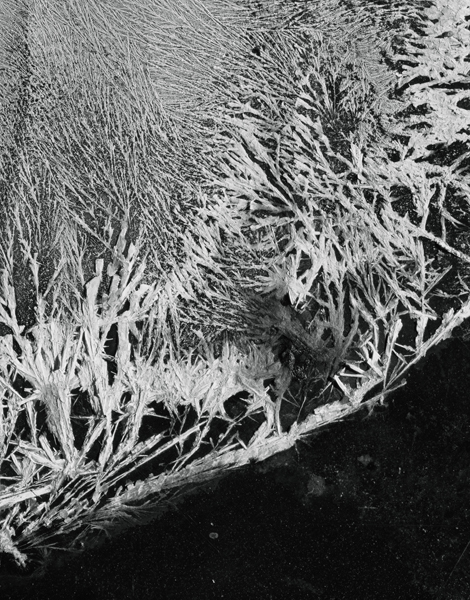
These photographs are amazing, I really like how close up they are, like they are macro shots. The detail is extraordinary, The use of the black negative space is also really good, It allows the white of the image to stand out even more. It also allows the white crystals to be the integral part of the image and it means that is is the main focal point of both the images. In these images there is a strong depth of field. There is also a quite strong foreground and background in both the images, This adds something strong to the images and makes them feel like they are three dimensional. I feel it is also nice to not know exactly what you are looking at, it makes it more interesting and makes you wonder what it is exactly.
I used another block of ice with another photograph in it, this time I poured boiling water onto the ice, here are my contact sheets.
Here is my favourite.
This photograph is really fascinating, I really like the misty effect in the ice as it allows you to make out most of the image, but then also stops you knowing what the image is exactly. The cracks are also really amazing, I really like how they are completely random and this makes them even more interesting and means that if i did it again they could and most likely would be completely different.
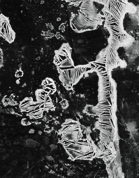
For my next development I decided to look further at the idea of cracking ice, As I was taking ice out the freezer I accidentally dropped it and it cracked. I then decided to look further into this, below are my contact sheets.
For my next development I decided to look further at the idea of cracking ice, As I was taking ice out the freezer I accidentally dropped it and it cracked. I then decided to look further into this, below are my contact sheets.
I find these photographs really interesting, I really like how random the cracks are I also really like how the ice never completely fell off the picture so part of it was still always covered up. Below are my favourites.
Artist and me
|
Me

|
Kate Jackling

|
Both these photographs really interest me and and very similar in many ways, for example they both have negative space, in Jackling's this is the black which in turn brings out the white in the photograph, in my photograph the negative space is the orange and black photograph frozen in the ice. at this extenuates the cracks and the white crystal texture. Both these photographs are completely random and one of a kind.The cracks in my photograph are completely random and so are the crystal formations in Jackling's. In both photographs the cracks and crystals are the integral part of the composition and the min focal point as this is what you first look at when you see the image, coming back to what I said before this is caused by the negative space in the image.
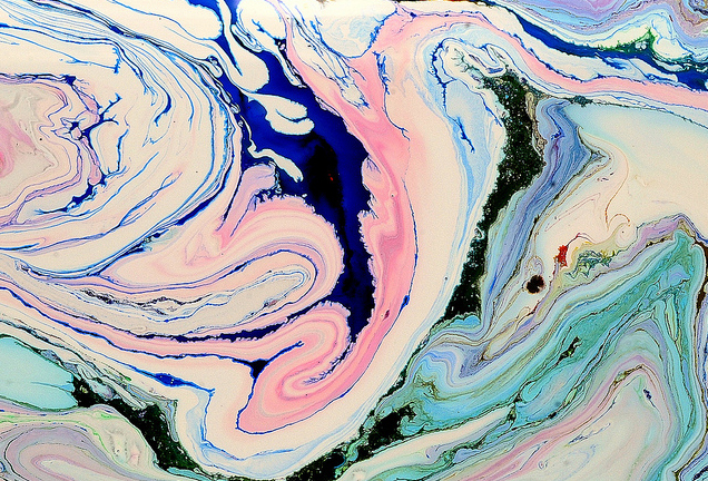
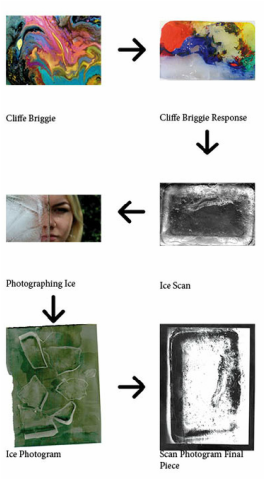
Cliffe Briggie
These wild macrophotography caught our eye recently. Here Photographer Cliffe Briggie combines water, colour and ice to create these complex abstract visuals. Briggie explains “I make photographic images by opening heart and mind to their naturally wakeful state—a vivid, raw, intimate experience. Choice of subject is guided by what flickr colleague Brad Wise calls the hidden energies within ordinary objects. ”
Here are some examples of his work.
Here are some examples of his work.

|

|
To create these incredible and striking images, Briggie uses watercolour and paints onto ice, This is how the swirls and the random blending effect comes from. Like the work of Kate Jacking above these photos really interest me as they are completely random and the outcome is never the same even if the same colours are used etc. The main focal points of the images are the bright yellow and pink swirls on the right and the dark and vibrant blue in the image on the left. Briggie allows his his creations to fill the frame and does not feel the need for negative space to make his images stand out ore.
I decided to try this my self, Below is my contact sheet.
I decided to try this my self, Below is my contact sheet.
|
|
Here are my favourites
I really like these photos however I used the wrong paint, instead of watercolour paint I used acrylic. This meant that it dried up on the ice and the only way to get it to melt and move about was to heat it up I did this with a hair drier. The hair drier also moved the paint about to create the nice patterns that you can see above. I am going to try this again except next time I will use watercolour paint so it is more in the style of Cliffe Briggie.
Artist and me
|
Me

|
Cliffe Briggie
|
I feel these photos are similar in some ways, in both the images, the paint is swirling around on the ice and has created these beautiful streaks of paint. In my photograph I have used acrylic paint, it wasn't very runny and didn't move around much although I like how it has stained the ice, I think this adds something really nice tot the image. In Briggie's image there is no ice, as it is all covered by paint, This is also really nice but it makes the image look a bit two dimensional whereas I think my image looks quite three dimensional.
After looking at this I decided to go back and look again at the idea of freezing things. I decided to scan some ice to see how this turned out, The scan is below.
I think the scan is really interesting as it shows all the little imperfections that are within the ice and on the surface, For example you can see air bubbles and small cracks around the ice as well as some water inside from where the ice had melted a bit. I decided to put this same scan into black and white, this is below. In the black and white scan the imperfections are even more exaggerated.
I wanted to look at the idea of photographing through ice so I made some thin ice and photographed through it below are my contact sheets.
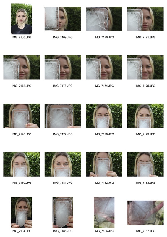
|
|
Here are my favourites.
I really like these images, I really like how the view through the ice is more in focus then the real world view, I feel this is really powerful. I also really like ho you can see the flaws and imperfections of the ice really clearly. The man focal point of the images is the part of the ice where you can see through onto the face. I think the first photo is the most powerful as there are two different negative spaces used, the dark green of the bush behind the girl and the white of the ice. This draws your eyes towards the face, thus making it the integral part of the composition.
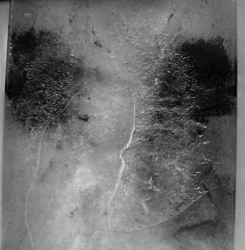
I then decided to continue the idea of photographing trough ice, but this time use a completely different technique, make photograms. I melted the edges and parts of the ice blocks. The ice would be placed onto photographic paper and I would shine a light through the ice to create a pictogram. These pictograms are below. I used different paper, this will also be shown below.
Normal Photographic paper
Matt photographic paper
Tinted photographic paper
I really like these images, I think it is really interesting how the light acts on the paper when it hits the ice. With the photograms of broken up ice, too me it looks like a mountain range viewed from above.
After doing these dark room experiment I found an artist called Adam Fuss
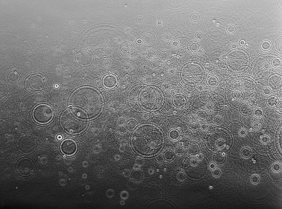
Adam Fuss
Adam Fuss, born in 1961, has refined a camera-less technique in his work, relying on the most basic infrastructure of photography: objects, light and light-sensitive material. His work includes photograms of water droplets, smoke, flowers, christening gowns, and birds captured in flight. He is also known for reviving the laborious daguerreotype technique, with breathtaking results. Below are some examples of his work.
|

|
These images are really amazing, Fuss creates these photograms by putting trays of water on top of photographic paper, he then drops in more water to create ripples which he uses to create photograms with. These images are really interesting I really like how the ripples turn out grey on a darker background. The bigger ripples are the main focal points of each image and the part that you notice first. the negative space in each image is really nice and works really well as it makes the ripples even more interesting.
Artist and me
|
Me

|
Adam Fuss
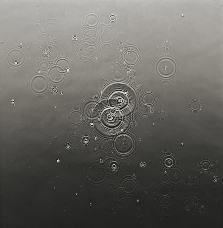
|
Both these images are really interesting, I really like how they are both made out of very different tones, For example it is not either just white or black, but instead there are lots of greys and mid tones. In my photogram however the paper was stained green. I feel this gave an even more interesting effect and gave an even further range of colours and tones within the image. The negative space is also very important in both images as it means that the main and most important part of the image, whether it is ice or a ripple, stands out much more clearly.
For my next development I am going to print these photos onto acetate and then create more photograms with the acetate.
These photograms are really interesting, I really like how you can still see all the detail which was on the scan originally and I also find it interesting how the photogram changes what was a positive image into a negative image.
Final Piece
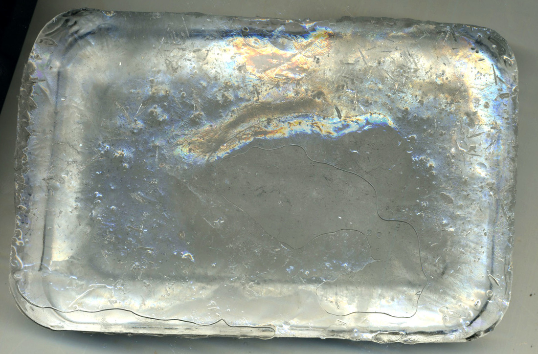
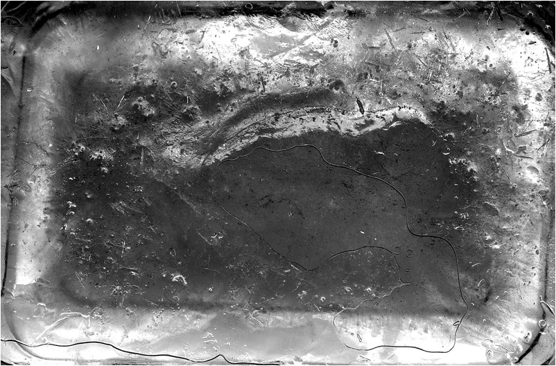
For my final piece I have decided to carry on with the idea of scanning ice, I made various different ice cubes which had different colours inside of them, this created different textures in the ice.
I put the photos in black and white.
I think the photos look a lot better in black and white, I really like how you can see the textures more clearly and makes the images more striking.
Simon ward
Simon Ward does not use a camera for his photography, instead he uses a scanner to create his pieces. He uses a multitude of subject matter, from cats and other small animals to plates and signs. Below are some examples of his work.

|

|
These images are really interesting, I really like how they are scans instead of conventional photographs as it make it even more intriguing Scanning these birds is a really good way of photographing them and it allows you to see all the minute detail and textures that may either have been very hard or impossible to capture with a conventional camera a camera. The black negative space is also very important to both the images above as it means that you can focus on the detail in the images without being distracted wit something in the background. This background cause the birds to be the main focal point and integral to the composition. The bird is places in the middle of the frame so you can see the whole shape of the bird rather than just a small part, I feel this is also important for the images.
Artist and me
|
Me
|
Simon Ward

|
Both these images are created using a scanner rather than a conventional camera. I feel that for the subject matter in each image, ice in my image and a bird in his, scanning is a very good way of being able to capture every flaw and perfection in the image. Without a scanner it would be very hard to photograph the small cracks in the ice that you can see as well as the small air bubbles, In his image it would be hard to capture the shadows and minute detail. the scanning also allows the colours to be very vibrant, mine is in black and white as it made the imperfections more visible. The black background works really well in Ward's image. I have a dark grey background in mine, I feel if i was black it would look better and make the rest of the image more striking.
For my final piece I am going to put these scans into photograms like I have done above and them freeze them into ice blocks. Here are the photograms I will be using.
I am really proud of these photograms, My favourite part of them is the fact that they became very abstracted during the process I went through. This process was scanning the ice, putting the scans onto acetate and finally using the acetate prints to make photograms again. I really like how they are very abstracted, almost to the point that it starts to look like something else. The fourth image above looks to me like a river going through a city. I also really like how the photos hve turned into negatives, I feel this gives the photograms a nice twist.
Sam Taylor wood
Sam Taylor-Wood was born on the 4th of March 1967, she is an English filmmaker, photographer and visual artist. Her directorial feature film debut came in 2009 with Nowhere Boy, a film based on the childhood experiences of the Beatles songwriter and singer John Lennon. She is one of a group of artists known as the Young British Artists. Taylor-Johnson began exhibiting fine art photography in the early 1990s. In 1994, she exhibited a multi-screen video work titled Killing Time, in which four people mimed to an opera score. From that point multi-screen video works became the main focus of Taylor-Wood's work. Taylor-Wood was nominated for the annual Turner Prize in 1998, but lost out to the painter Chris Ofili.
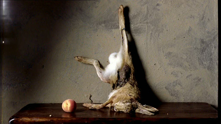
|
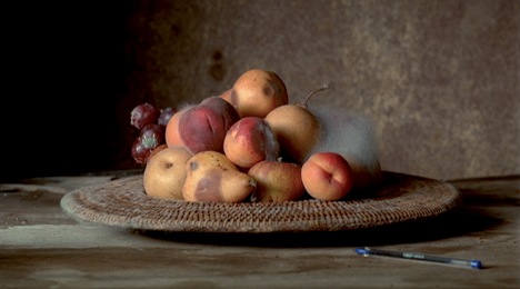
|
Both these images are stills from her films about decaying fruit and animals. Both these films are time lapses of the processes that take place as certain things degrade and break down. Both the films have the main and integral part of the film in the centre of the frame at all time. This is so you attention is always on the most important part of the film. The wall behind the integral part of the composition and the table it is places on is dull and boring, this is so you are not distracted during her films. In each of her films she leaves something extra in the frame like a pen for example, this is to show scale and could be to prove that the fils are not cut or edited.
I feel these films link to my final piece as they are time-lapses of things degrading and wasting away, much like my time-lapse of ice melting will be.
I feel these films link to my final piece as they are time-lapses of things degrading and wasting away, much like my time-lapse of ice melting will be.
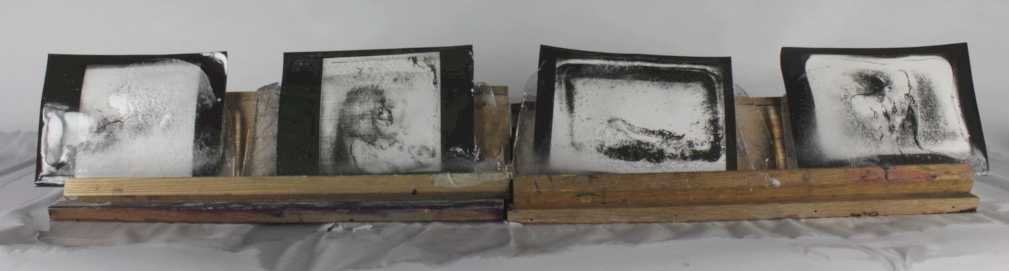
I will put my photograms into blocks of ice and then mount the ice blocks onto a small slanted shelf and create a time lapse of the ice melting over the course of a day. The time lapse will be below.
To crate this piece I froze four A5 photograms into ice, I then set them up on four small shelves, I then used an intervolometer to take a photo every 5 minutes until the ice melted fully. I am really happy with the time lapse and I think it is really interesting to see how the ice melted in different stages.
Ilsoo Yang
Ilsoo Yang is a YouTuber who uploads a few short video time lapses of ice cream melting, Below is his work.
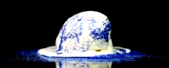
These time-lapses are really interesting, it is really interesting to see how the ice cream melts and how it behaves during and after it. All the shots are with the ice cream in the middle of the frame and integral to the composition. The frame is also closely cropped this is to reduce negative space once all the ice cream has melted, however before the ice cream has melted the back ground and negative space is dark and neutral, this is so your attention is kept on the ice cream and so it remains the main focal point.
Artist and me
|
Me
|
Ilsoo Yang

|
Both the photos above are stills from two different time-lapses. They are very similar as they are of ice melting and disappearing, however in Yang's he focus' on the melted ice cream as much as he focus' on it melting. On the other hand in my time lapse I only focus on the ice melting and not really what happens to the water after. In both the time-lapses the ice or ice cream is integral to the composition and is the main focal point of the frame. In my piece I use a white background, therefore having white negative space. In Yang's he uses a black background, I think this would be interesting to try if I was going to try again. These backgrounds are plain so you do not get distracted by them and only focus on the integral part of the composition. The frames are also cropped in quite close< this again is so you only focus on the part of the frame that is important and do not get distracted by other things that could be going on within the frame.
Conclusion
I set out at the beginning of this project thinking that I wanted to look at macro shots of things with flaws and imperfections, but as I started developing and looking at artists I started refining what I was looking at and eventually I ended up with Blake Little which was a key defining moment of my developments and refinement, as his work got me into looking at the idea of freezing thing and things being stuck in time. From there I went on to my final piece. It is not at all what I first envisioned it would end up as but it I think it is really strong and represents all the techniques and ideas I wanted it to show. My developments were concise and flowed well, a magnitude of techniques were looked at before I chose the ones I liked. If I was to change my final piece I may try experimenting with Black or darker backgrounds as this may show the ice more clearly. I would also use white shelves or darker colour shelves depending on the background colour so the ice appears to be floating or look like it was free standing. These are small changes, however I feel I still managed to achieve everything I wanted to within this unit.
